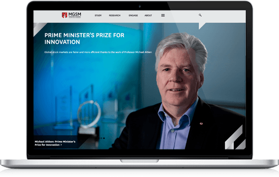
Project overview
- Client: MGSM
- Start date: 2015
- Project length: 6 months
- Services delivered: Enterprise CMS; Personas; Information architecture
- Visit the MGSM website
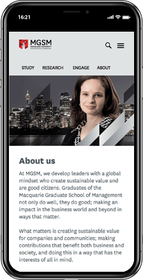
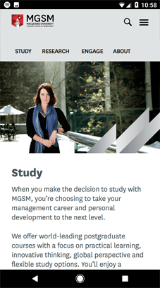
MGSM approached Polished Pixels in August 2015 wanting a new user-friendly website that would better reflect their prestigious MBA and management programs.

About MGSM
In 2016 MGSM was once again ranked the number one School in Australia by the Financial Times world MBA ranking. The School is one of only three Australian business schools to make the prestigious top 100.
The MGSM has centres in:
- the heart of Sydney's business district
- North Ryde and;
- Hong Kong
The Macquarie Graduate School of Management (MGSM) entrusted Polished Pixels with the task of re-building their website from the ground up.
This case study outlines how we built, tested and launched a website for MGSM, to deliver a powerhouse website that clearly communicates the benefits of MGSM.
Polished Pixels is proud that the MGSM has entrusted us to rebuild their website and we are honoured to have the opportunity to work with such a respected and successful business school.
Goals
We started by sitting with the project owner and listening to their pain points and goals
Over a coffee, we learned about what MGSM wanted to achieve, and what role the website would play in this over-arching strategy.
We listened to a brief over-view of the website, and the initial thoughts on how the client would like it improved.
We then gave some initial feedback on how we thought the website could be improved, and the expected results from the improvements such as:
- more leads through more compelling web content
- increase in visitors from search engines
- more enquiries from people using mobile phones
- improved user experience through a faster loading website
- improved brand through a more user-friendly website
- faster interactions through more intuitive navigation paths.
Solution
- We completed a content audit and organised for content to be updated
- target audiences were documented and turned into user-friendly personas
- we developed a new menu structure (card sorting and tree testing)
- we rebuilt the website in Squiz Matrix CMS
- we re-branded the website using the client's new design elements that were supplied to us
- we tested and quality assured and successfully launched the new website.
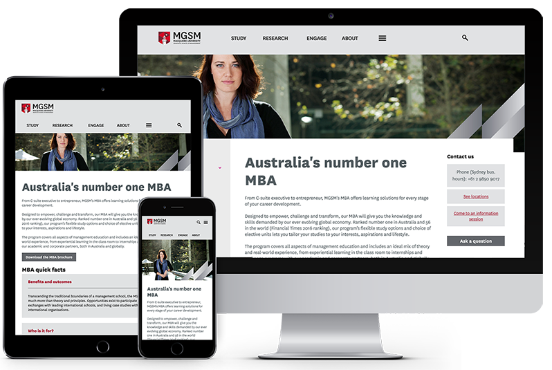
Project results
This project was delivered on time and on budget.
Better web content
- our work led to better engagement from the website visitors
- the volume of quality organic traffic increased after launch
- increases in organic traffic resulted in significantly more people making contact
- more people are using their mobile devices to engage with the website.
More case studies
-

Finance Finance website
Enterprise CMS

-

Finance Case study of a financial services website rebuild
Enterprise CMS

-

Hospitality Hotel website
Enterprise CMS; Personas; Information architecture

-
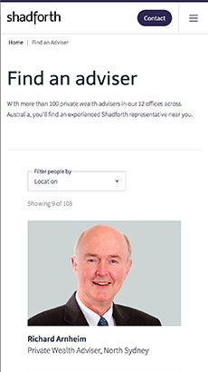
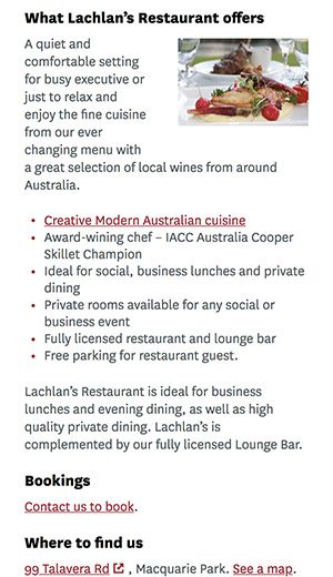
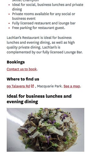
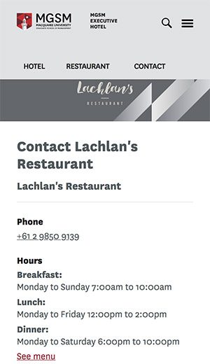
Hospitality Restaurant website
Enterprise CMS; Personas; Information architecture


